
What you will learn?
Build professional web pages from scratch
Master responsive layouts
Manipulate the DOM dynamically
Create dynamic web components - Image Gallery Project
Style tables and forms
Create Projects from scratch
Master Git & GitHub
About this course
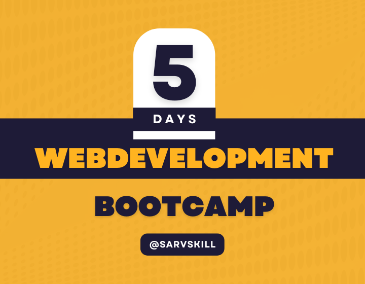
Welcome to the 5-day Web Development Bootcamp! This Bootcamp is designed to take you from the basics of HTML and CSS to creating dynamic, responsive web pages with JavaScript and modern CSS frameworks like Bootstrap By the end of this bootcamp, you'll have the knowledge and confidence to start building your own web projects or even pursue a career in web development!
Bonus 1: Overview Frontend, Backend and Fullstack Developer & Web Development Setup |
Day 1: Introduction to HTML & CSS, linking files, basic CSS properties, box model, and how to style links and images. |
Day 2: HTML tables and forms, semantic HTML tags like header, footer, nav and styling tables and forms. |
Day 3: Introduction to flexbox, flex-grow, flex-shrink, flex-wrap, media queries for responsive design, and basic JavaScript. |
Day 4: Manipulating the DOM with JavaScript, event handling, adding/removing elements, and building a dynamic image gallery. |
Day 5: Introduction to Bootstrap/Tailwind CSS for responsive design, final project development. |
Bonus 2: Build a one page website. |
Bonus 3: Git and GitHub |
With a focus on practical learning, this bootcamp is ideal for anyone looking to dive into the world of web development quickly.
Requirements
Have a computer with Internet
Be ready to learn an insane amount of awesome stuff
Prepare to build real web apps!
No prior experience in coding is required!
FAQ
Comments (0)
test
In this bonus video, you’ll get an introduction to the different aspects of web development: frontend, backend, and full-stack. You’ll learn the key differences between them and how they work together to create full web applications. We’ll also walk you through setting up your developer environment with VS Code and running your very first HTML program. This is an essential session for anyone looking to get a full picture of web development.
In this video, you'll get a strong foundation in HTML and CSS, the core building blocks of any website. We'll start by introducing HTML, learning about the key elements like tags, attributes, and structure. Then, you'll dive into CSS, where you'll learn how to style your HTML elements to create beautiful, engaging webpages. You’ll also learn about the box model, link styling, and how to position and style images using CSS. By the end of this video, you’ll have built your very first professional webpage!
What You’ll Create: A basic webpage with text, images, and links styled with CSS.
On Day 2, we’ll focus on creating structured content using tables and forms, two essential features for building user interfaces. You’ll learn how to create a data table with HTML and style it using CSS. After that, we’ll move to interactive forms, where users can input information. This session also covers Semantic HTML to improve accessibility and SEO of your web pages. Finally, you’ll learn how to style forms and tables to create professional-looking user inputs.
What You’ll Create: A contact form and a user data table.
On Day 3, we tackle the crucial topic of responsive web design. You’ll learn how to use Flexbox, a powerful layout tool that allows you to align and distribute space among items in a container. You’ll explore properties like flex-grow, flex-shrink, and flex-basis, ensuring that your layouts are flexible and adaptive. Then, you’ll learn how to use media queries to make your designs look perfect on any screen size, from mobile phones to desktops. By the end, you’ll have created a layout that looks professional on all devices!
What You’ll Create: A responsive layout using Flexbox and media queries.
Flexbox, or the Flexible Box Layout, is a CSS layout model designed to create flexible and responsive layouts with ease. It allows elements within a container to align and distribute space efficiently, even when their size is unknown or dynamic. Using properties like `justify-content`, `align-items`, and `flex-direction`, flexbox provides control over the alignment, spacing, and orientation of elements in both rows and columns. This makes it ideal for designing complex layouts that need to adapt seamlessly across different screen sizes without relying on floats or positioning tricks. Flexbox simplifies tasks like centering items, creating equal-width columns, and managing the overall layout structure in a fluid and responsive manner.
flex-grow and flex-shrink are two key properties in the Flexbox layout model that control how flex items behave when the size of their container changes.
Together, these properties enable flexible and dynamic layouts, allowing elements to adapt to varying screen sizes and container dimensions.
A **media query** is a CSS technique used to apply styles based on the characteristics of the user's device, such as screen size, resolution, or orientation. It allows you to create responsive web designs that adapt seamlessly to different screen sizes, ensuring a consistent user experience across devices like mobile phones, tablets, and desktops. By using media queries, you can define specific breakpoints (like `max-width` or `min-width`) and apply different CSS rules depending on the device's characteristics.
This enables you to adjust layouts, font sizes, images, and other elements to make the website look and function optimally on any screen size.
JavaScript enables developers to create interactive and dynamic content on websites, enhancing user experience. In this section, you'll learn about JavaScript's role in the web ecosystem, how it interacts with HTML and CSS, and its core features
Day 4 is all about JavaScript and how to use it to make your web pages dynamic and interactive. You’ll start by learning how to manipulate the DOM (Document Object Model), selecting and modifying elements on the fly. You’ll also learn how to add and remove elements dynamically, allowing your users to interact with the website. We’ll cover events like click and mouseover, and show you how to handle user interactions. By the end of this section, you’ll build a dynamic image gallery where users can add and remove images.
learning how to manipulate the DOM (Document Object Model), selecting and modifying elements on the fly. You’ll also learn how to add and remove elements dynamically, allowing your users to interact with the website. We’ll cover events like click and mouseover, and show you how to handle user interactions.
In Part 1 of this topic Creating an image gallery using HTML and CSS focuses on responsive design techniques to ensure the gallery looks great on various screen sizes and devices.
In Part 2, we will enhance the image gallery by incorporating JavaScript to add interactivity and dynamic features, making the gallery more engaging for users. This section focuses on using JavaScript to manipulate the DOM, enabling functionalities that enhance the user experience.
In the Fifth day of the bootcamp, you’ll learn about Bootstrap One of the most popular CSS frameworks. These tools allow you to create responsive websites quickly using pre-built components like navbars, buttons, and grids.
We Also create One Project.
you will learn how to leverage Bootstrap's extensive library of pre-built components, grid systems, and utility classes to streamline your web development workflow
In this project, you will learn how to create a clone or a similar layout to YouTube, one of the most popular video-sharing platforms, using HTML, CSS, and JavaScript. The project will guide you through designing a responsive and user-friendly interface, You will implement responsive design techniques to ensure that the layout adapts seamlessly to different screen sizes, making it accessible on both desktop and mobile devices.
In this bonus video, we’ll cover the essentials of Git and GitHub, the industry-standard tools for version control and collaboration. You’ll learn how to initialize a Git repository, track changes, and commit code. You’ll also discover how to push your project to GitHub and collaborate with others on code. This is an essential skill for any developer looking to work on projects efficiently and in teams.

Reviews (1)


